Documentation
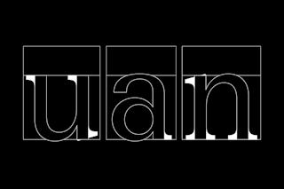
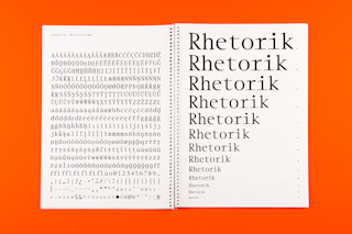
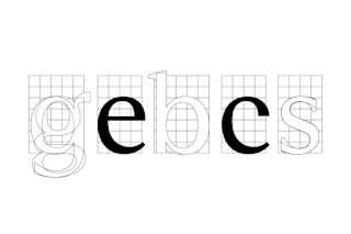
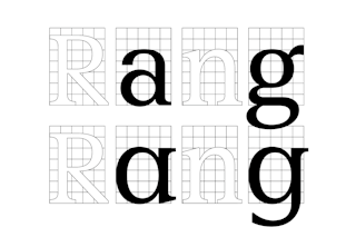
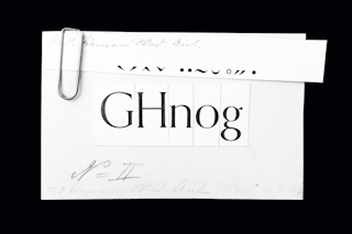
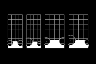
A stark white page with two words introduces the chapter: »rhetorik« and ‘Rhetoric’ are the sections of Otl Aicher’s 1988 book Typographie where he ruminates on how the same idea can be formed in multiple ways. This condition is not unique to a specific language, but instead is universal. The specific syntax one uses becomes important to consider, as the way in which information is presented determines the success of its communication.¹ Today, Rhetorik is a versatile family with a spectrum of styles which allow it to excel both in text typesetting as well as display usage, with perhaps its most promising potential application being complex identity projects. Stylistic sets of text and display versions keep historical aspects alive (a postmodern Aicher ‘b’ for instance) while also offering flexibility with simplified alternates. Rhetorik challenges the definition of a type family, combining both sans and serif styles in a manner unlike its predecessors. This superfamily was built on a modular, component-based system in order to simplify construction and achieve consistency. The letterforms were then refined through optical correction in each cut. In this way, Rhetorik fulfils the dream of today’s art director; a simplified, contemporary reinvention of Aicher’s Rotis (1988).
Read more →
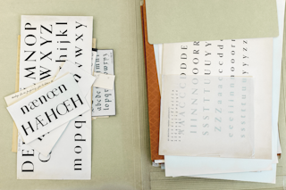
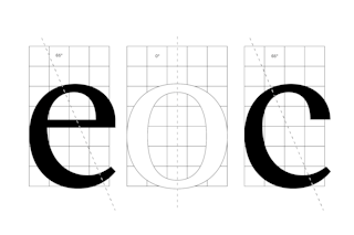
‘Family’ becomes an interesting lens through which to view Aicher’s legacy, as throughout his career he valued creating networks to stimulate growth.² It is fitting that Rhetorik also developed through a diverse lineage of references, after a thorough study of many important figures within German design. It is through Walter Tiemann’s font Orpheus³ where Rhetorik formally starts. An interpretation of Orpheus was developed through an experimental process where the contrast was increased, and serifs were added, modified and removed. The result bore a resemblance to Aicher’s Rotis, planting the seed to create a family with both a sans and serif style – one which would, in a unique way, preserve some of the character present in Orpheus. Through this process an idea of ‘constructed calligraphy’ was often referenced, with the presence of the pen in the forms, occasionally supplemented with constructed drawings.
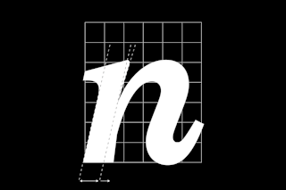
This methodology continues in the italic cuts. On the ‘constructed’ side, the sans italic has been created by mechanical slanting, and fine-tuned through optical correction. In contrast, the serif style features a true italic, a ‘chancery’ hand style – almost completely calligraphic, while at the same time conveying a contemporary feeling through its digital formation. These moments are particularly present in the ‘n’ ‘v’ and ‘k’ which relay both a sense of writing and construction within the same letter. Emil Rudolf Weiß’s Weiß-Antiqua (1924) also served as another reference from German type design history, providing inspiration for solving certain challenges during the development of the italic cuts.
Aicher, inspired by other families such as Univers and Times, did not necessarily achieve the results he set out for.⁴ A common perception of Rotis is that it as an ‘art director’s typeface,’ working well in architectural and branding contexts, but overly-stylised for other uses. Rhetorik creates something new through meticulous editing and synthesising of all of these points in history. The overall volume has been reduced from its sources in order to yield a functional type system while maintaining the concept of marrying a sans and a serif. Two styles have been brought together, but perhaps (as in an actual marriage) there is occasionally still some tension, which gives the family a distinct attitude. It is committed to the long haul, with many stylistic decisions resisting the flow of trends in type design today.
1 Otl Aicher, Typographie, Ernst & Sohn Verlag, Berlin, 1988, p 94.
2 Aicher’s first design commissions were lecture posters for Ulmer Kreis (Ulm Circle of Friends) which he established with close associates to revitalise his post-war town. Later, together with Max Bill, he founded the seminal Hochschule für Gestaltung Ulml, and towards the end of his life established the Rotis Institut für analoge Studien.
3 Giovanni Francesco Cresi worked as a calligrapher for the Vatican in Rome in the 16th century, also publishing his own work, writing models and teaching scribes at the Sistine Chapel. One of Cresi’s calligraphic models was later interpreted by Walter Tiemann and developed into Orpheus in 1962. Tiemann was an enormously influential figure within German design, releasing his work through Klingspor Foundry and teaching at Staatliche Akademie für Graphische Künste in Leipzig, where Jan Tschichold was one of his students.
4 Aicher’s conception of the modern movement formed an ideology so strong that perhaps it blinded his process. His 1991 book, Die Welt als Entwurf (The World as Design) preached that there was no place in the world for beautiful artworks which do not have any function. For anyone who has read this book, the irony is quite present – the type it was set in, Rotis, seems to directly oppose those values, appearing to be more about its form than its function, sacrificing legibility while undoubtedly flaunting a certain style.
Technical Information:
Design: Sascha Bente
Classification: Humanist Serif
Cuts: 10 (5 styles with italics)
Mastering: Michele Patanè
Cover image: Olga Prader
First sketch: 2019
Released: 2022
Latest update: 02/2022
Initiated at ECAL
OpenType Features:
- aalt
- Access All Alternates
- calt
- Contextual Alternates
- case
- Case Sensitive Forms
- ccmp
- Composites
- dlig
- Discretionary Ligatures
- dnom
- Denominator
- frac
- Fractions
- liga
- Standard Ligatures
- locl
- Localized Forms
- numr
- Numerator
- ordn
- Ordinals
- pnum
- Proportional Figures
- sinf
- Scientific Inferiors
- subs
- Subscript
- sups
- Superscript
- tnum
- Tabular Figures
- ss01
- ss01
- ss02
- ss02
Supported Languages:
Afrikaans, Albanian, Asu (Tanzania), Basque, Bemba (Zambia), Bena (Tanzania), Breton, Catalan, Chiga, Cornish, Croatian, Czech, Danish, Dutch, Embu, English, Esperanto, Estonian, Faroese, Filipino, Finnish, French, Friulian, Galician, Ganda, German, Gusii, Hungarian, Icelandic, Inari Sami, Indonesian, Irish, Italian, Jola-Fonyi, Kabuverdianu, Kalaallisut, Kalenjin, Kamba (Kenya), Kikuyu, Kinyarwanda, Latvian, Lithuanian, Lower Sorbian, Luo (Kenya and Tanzania), Luxembourgish, Luyia, Machame, Makhuwa-Meetto, Makonde, Malagasy, Maltese, Manx, Meru, Morisyen, North Ndebele, Northern Sami, Norwegian Bokmål, Norwegian Nynorsk, Nyankole, Oromo, Polish, Portuguese, Quechua, Romanian, Romansh, Rombo, Rundi, Rwa, Samburu, Sango, Sangu (Tanzania), Scottish Gaelic, Sena, Serbian, Shambala, Shona, Slovak, Slovenian, Soga, Somali, Spanish, Swahili (macrolanguage), Swedish, Swiss German, Taita, Teso, Turkish, Upper Sorbian, Uzbek, Volapük, Vunjo, Walser, Welsh, Western Frisian, Zulu
Buy Rhetorik Serif Family
Single Styles
Buying guide
We offer the possibility of buying individual styles as well as complete families. The price shown is the cost of our most basic licence. Further licencing options are available during the checkout process.
Character Overview
- Character name
- Unicode Decimal
- 65
- Unicode Hex
- 41
- HTML Entity (Hex)
- A
Uppercase
- 65A
- 66B
- 67C
- 68D
- 69E
- 70F
- 71G
- 72H
- 73I
- 74J
- 75K
- 76L
- 77M
- 78N
- 79O
- 80P
- 81Q
- 82R
- 83S
- 84T
- 85U
- 86V
- 87W
- 88X
- 89Y
- 90Z
Lowercase
- 97a
- 98b
- 99c
- 100d
- 101e
- 102f
- 103g
- 104h
- 105i
- 106j
- 107k
- 108l
- 109m
- 110n
- 111o
- 112p
- 113q
- 114r
- 115s
- 116t
- 117u
- 118v
- 119w
- 120x
- 121y
- 122z
Uppercase Accents
- 193Á
- 258Ă
- 194Â
- 196Ä
- 192À
- 256Ā
- 260Ą
- 197Å
- 195Ã
- 198Æ
- 262Ć
- 268Č
- 199Ç
- 264Ĉ
- 266Ċ
- 208Ð
- 270Ď
- 272Đ
- 201É
- 276Ĕ
- 282Ě
- 202Ê
- 203Ë
- 278Ė
- 200È
- 274Ē
- 280Ę
- 7868Ẽ
- 286Ğ
- 284Ĝ
- 290Ģ
- 288Ġ
- 294Ħ
- 292Ĥ
- 7716Ḥ
- 306IJ
- 205Í
- 206Î
- 207Ï
- 304İ
- 204Ì
- 298Ī
- 302Į
- 296Ĩ
- 308Ĵ
- 310Ķ
- 313Ĺ
- 317Ľ
- 315Ļ
- 7734Ḷ
- 321Ł
- 323Ń
- 327Ň
- 325Ņ
- 330Ŋ
- 209Ñ
- 211Ó
- 334Ŏ
- 212Ô
- 214Ö
- 210Ò
- 336Ő
- 332Ō
- 216Ø
- 213Õ
- 338Œ
- 222Þ
- 340Ŕ
- 344Ř
- 346Ś
- 352Š
- 350Ş
- 348Ŝ
- 536Ș
- 7838ẞ
- 358Ŧ
- 356Ť
- 354Ţ
- 538Ț
- 218Ú
- 364Ŭ
- 219Û
- 220Ü
- 217Ù
- 368Ű
- 362Ū
- 370Ų
- 366Ů
- 360Ũ
- 7810Ẃ
- 372Ŵ
- 7812Ẅ
- 7808Ẁ
- 221Ý
- 374Ŷ
- 376Ÿ
- 7922Ỳ
- 377Ź
- 381Ž
- 379Ż
Lowercase Accents
- 225á
- 259ă
- 226â
- 228ä
- 224à
- 257ā
- 261ą
- 229å
- 227ã
- 230æ
- 263ć
- 269č
- 231ç
- 265ĉ
- 267ċ
- 240ð
- 271ď
- 273đ
- 233é
- 277ĕ
- 283ě
- 234ê
- 235ë
- 279ė
- 232è
- 275ē
- 281ę
- 7869ẽ
- 287ğ
- 285ĝ
- 291ģ
- 289ġ
- 295ħ
- 293ĥ
- 7717ḥ
- 305ı
- 237í
- 238î
- 239ï
- 236ì
- 307ij
- 299ī
- 303į
- 297ĩ
- 309ĵ
- 311ķ
- 312ĸ
- 314ĺ
- 318ľ
- 316ļ
- 7735ḷ
- 322ł
- 324ń
- 329ʼn
- 328ň
- 326ņ
- 331ŋ
- 241ñ
- 243ó
- 335ŏ
- 244ô
- 246ö
- 242ò
- 337ő
- 333ō
- 248ø
- 245õ
- 339œ
- 254þ
- 341ŕ
- 345ř
- 347ś
- 353š
- 351ş
- 349ŝ
- 537ș
- 223ß
- 359ŧ
- 357ť
- 355ţ
- 539ț
- 250ú
- 365ŭ
- 251û
- 252ü
- 249ù
- 369ű
- 363ū
- 371ų
- 367ů
- 361ũ
- 7811ẃ
- 373ŵ
- 7813ẅ
- 7809ẁ
- 253ý
- 375ŷ
- 255ÿ
- 7923ỳ
- 378ź
- 382ž
- 380ż
Ligatures
- 64257fi
- 64258fl
Proportional Figures
- 480
- 491
- 502
- 513
- 524
- 535
- 546
- 557
- 568
- 579
Tabular Figures
- 480
- 491
- 502
- 513
- 524
- 535
- 546
- 557
- 568
- 579
Dingbat Numerals
- 9450⓪
- 9312①
- 9313②
- 9314③
- 9315④
- 9316⑤
- 9317⑥
- 9318⑦
- 9319⑧
- 9320⑨
- 9471⓿
- 10102❶
- 10103❷
- 10104❸
- 10105❹
- 10106❺
- 10107❻
- 10108❼
- 10109❽
- 10110❾
Currency & Math
- 8383₿
- 162¢
- 164¤
- 36$
- 8364€
- 8356₤
- 8378₺
- 163£
- 165¥
- 8901⋅
- 43+
- 8722−
- 215×
- 247÷
- 61=
- 8800≠
- 62>
- 60<
- 8805≥
- 8804≤
- 177±
- 8776≈
- 126~
- 172¬
- 94^
- 8734∞
- 8709∅
- 8747∫
- 960π
- 8710∆
- 8486Ω
- 181µ
- 8719∏
- 8721∑
- 8730√
- 8706∂
- 37%
- 8240‰
Superscript
- 8304⁰
- 185¹
- 178²
- 179³
- 8308⁴
- 8309⁵
- 8310⁶
- 8311⁷
- 8312⁸
- 8313⁹
Subscript
- 8320₀
- 8321₁
- 8322₂
- 8323₃
- 8324₄
- 8325₅
- 8326₆
- 8327₇
- 8328₈
- 8329₉
Ordinals
- 170ª
- 186º
Punctuation & Symbols
- 46.
- 44,
- 58:
- 59;
- 8230…
- 33!
- 161¡
- 63?
- 191¿
- 183·
- 8226•
- 35#
- 47/
- 92\
- 40(
- 41)
- 123{
- 125}
- 91[
- 93]
- 45-
- 8211–
- 8212—
- 95_
- 8218‚
- 8222„
- 8220“
- 8221”
- 8216‘
- 8217’
- 8249‹
- 8250›
- 34"
- 39'
- 9679●
- 9675○
- 9674◊
- 9632■
- 9633□
- 64@
- 38&
- 182¶
- 167§
- 169©
- 174®
- 8471℗
- 8482™
- 176°
- 8242′
- 8243″
- 124|
- 166¦
- 8224†
- 8225‡
- 65533�
Fraction
- 189½
- 8585↉
- 8531⅓
- 8532⅔
- 188¼
- 190¾
- 8533⅕
- 8534⅖
- 8535⅗
- 8536⅘
- 8537⅙
- 8538⅚
- 8528⅐
- 8539⅛
- 8540⅜
- 8541⅝
- 8542⅞
- 8529⅑
- 8530⅒
Arrows
- 8593↑
- 8599↗
- 8594→
- 8600↘
- 8595↓
- 8601↙
- 8592←
- 8598↖
- 8596↔
- 8597↕
