Documentation
AllCaps’ Society is a slow serif rooted in editorial tradition, drawn for thoughtful reading. It refers to a storied Czech typographic legacy, but is designed as a comprehensive family for tomorrow’s most beautiful books. The initial cut, with its simplified construction and focus on legibility in small sizes, reflects a slower, more deliberate culture of making – where every decision serves reading. Grounded in classic book faces like Baskerville and Times New Roman, Society adds a new touch through its distinctive ‘s’ and sharpened ‘z’, offset by initials and swashes. At first glance, Society seems humble. Practical. Considered. After a closer look, the wide-ranging family reveals inventive shape solutions honed through refined drawing.
Read more →
Type design in socialist Czechoslovakia was centralised and shaped by technical and industrial limits. In 1951 Grafotechna was founded through the merging of multiple private foundries, thereafter operating as the single official Czech manufacturer of metal type¹. Grafotechna’s catalogue grew slowly, laying the foundation for a modern Czech approach to type – grounded in utility, linguistic precision, and regulations of state publishing. New typefaces were most often commissioned through public competitions organised by the General Directorate of the Printing Industry and the State Printing Office (Státní tiskárna)². These competitions were commissioned in collaboration with outside institutions, each time centered around a different context (for example there were competitions focused on editorial fonts for books, newspapers or magazines, as well as separate competitions oriented towards producing more technical fonts for scientific publishing). Selected designs were passed on to Grafotechna for further development and release. A culture around these competitions was fostered through Typografia³, the journal for Czech printing and typography. The results of these competitions were published in detail, and issues of the journal were distributed to schools and print shops.
This system structured Czech-type design for decades, producing early post-war typefaces and also later releases like Academia⁴ and Public⁵. It shaped a generation of designers who learned to work within its structured, methodical framework. Each font followed a standardized format: individual characters were drawn on 60×60 mm ‘čtverčík’ cards – when reduced at a ratio of 12:1, this format aligned precisely to a 5 mm hot-metal matrix used in production⁶. These cards were accompanied by spacing charts and specimens which ensured technical clarity and consistency.
While independent foundries in Western Europe and the US were beginning to explore expressive, stylistic alternatives, Grafotechna followed a more practical path. Type was expected to perform efficiently for Czech and Slovak languages, prioritizing legibility, balance, and functionality. V češtině se často používají diakritická znaménka, což pro tvůrce písma představuje jedinečnou výzvu při vytváření rovnoměrné textury. Society captures the essence of this era – fusing it with new energy and diverse references, creating a contemporary type family that codifies a legacy of Czech editorial design.
1 Jindřich Vichnar, Antonín Rambousek, Původní československá typografická písma, Ministerstvo kultury ČSR, Prague, 1972, p.59.
2 Oldřich Hlavsa, Typografická písma latinková, SNTL, Prague 1957.
3 Typografia was the official professional journal of the Czechoslovak printing industry, first published in 1894 and later granted institutional status after 1948. Distributed to all state print shops, polygraphic schools, and industry professionals, it combined technical articles, theoretical essays, and printed type specimens.
4 Academia is a serif typeface designed by Josef Týfa around 1967–68, originally developed for scientific and academic publishing in Czechoslovakia. It was the result of a state-organised competition and was later produced by Grafotechna.
5 Public is a newspaper typeface designed by Stanislav Maršo in 1955 as part of a state-organised competition initiated by the Czech Department of Culture to address the shortage of quality fonts in post-war Czechoslovakia. The typeface was produced by Grafotechna in Regular, Bold, and Bold Condensed styles, optimised for line-composing machines and hand-setting.
6 Typografia journal, no. 842/7, p. 261, SNTL, Prague, 1972.
Technical Information:
Design: Ondrej Bachor
Production Assistance: Juan Feng
Classification: Transitional Serif
Cuts: 12 (6 styles with italics)
Mastering: Michele Patanè
Cover Image: Matej Martinec, Max Diemair
Text: Sean Kuhnke
First sketch: 2016
Released: 2025
Latest update: 06/2025
OpenType Features:
- aalt
- Access All Alternates
- c2sc
- Capitals to Small Caps
- calt
- Contextual Alternates
- case
- Case Sensitive Forms
- ccmp
- Composites
- dlig
- Discretionary Ligatures
- dnom
- Denominator
- frac
- Fractions
- liga
- Standard Ligatures
- lnum
- Lining Figures
- locl
- Localized Forms
- numr
- Numerator
- onum
- Oldstyle Figures
- ordn
- Ordinals
- pnum
- Proportional Figures
- sinf
- Scientific Inferiors
- smcp
- Small Caps
- subs
- Subscript
- sups
- Superscript
- swsh
- Swash
- tnum
- Tabular Figures
- ss01
- Alt S
- ss02
- Alt Q
- ss03
- Alt Z
- ss04
- Alt ( [ {
- ss05
- Circled numbers
- ss06
- Negative circled numbers
- ss07
- Numbers on square
- ss08
- Negative numbers on black square
- ss09
- Swash
Supported Languages:
Afrikaans, Albanian, Asu (Tanzania), Basque, Bemba (Zambia), Bena (Tanzania), Breton, Catalan, Chiga, Cornish, Croatian, Czech, Danish, Dutch, Embu, English, Esperanto, Estonian, Faroese, Filipino, Finnish, French, Friulian, Galician, Ganda, German, Gusii, Hungarian, Icelandic, Inari Sami, Indonesian, Irish, Italian, Jola-Fonyi, Kabuverdianu, Kalaallisut, Kalenjin, Kamba (Kenya), Kikuyu, Kinyarwanda, Latvian, Lithuanian, Lower Sorbian, Luo (Kenya and Tanzania), Luxembourgish, Luyia, Machame, Makhuwa-Meetto, Makonde, Malagasy, Maltese, Manx, Meru, Morisyen, North Ndebele, Northern Sami, Norwegian Bokmål, Norwegian Nynorsk, Nyankole, Oromo, Polish, Portuguese, Quechua, Romanian, Romansh, Rombo, Rundi, Rwa, Samburu, Sango, Sangu (Tanzania), Scottish Gaelic, Sena, Serbian, Shambala, Shona, Slovak, Slovenian, Soga, Somali, Spanish, Swahili (macrolanguage), Swedish, Swiss German, Taita, Teso, Turkish, Upper Sorbian, Uzbek, Volapük, Vunjo, Walser, Welsh, Western Frisian, Zulu
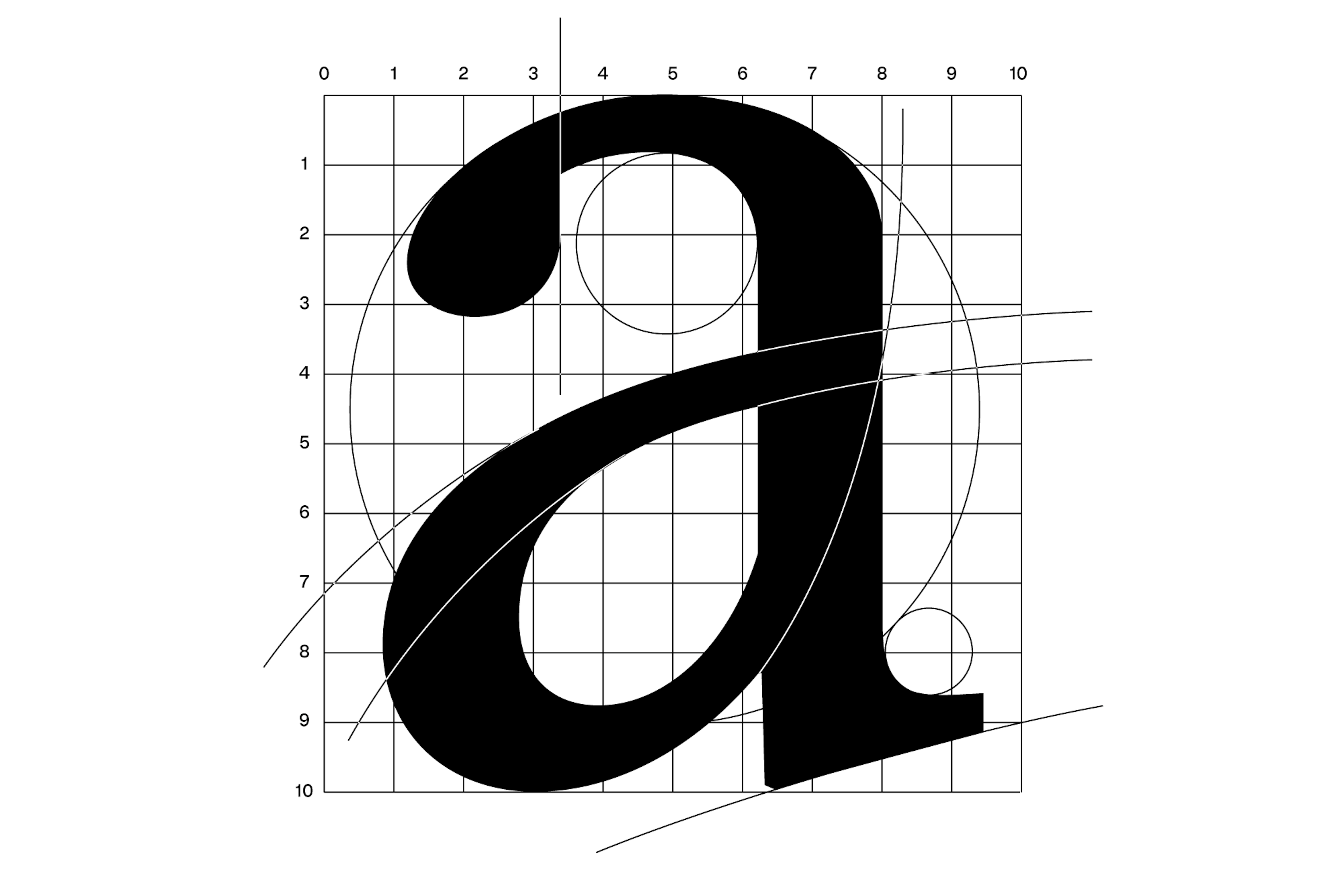
The ‘a’ is built on rectangular proportions, blending soft curves with the geometric logic of transitional type.

Founded in 1951 by merging multiple private foundries, Grafotechna became Czechoslovakia’s only industrial type foundry and sole supplier of metal type until 1990.
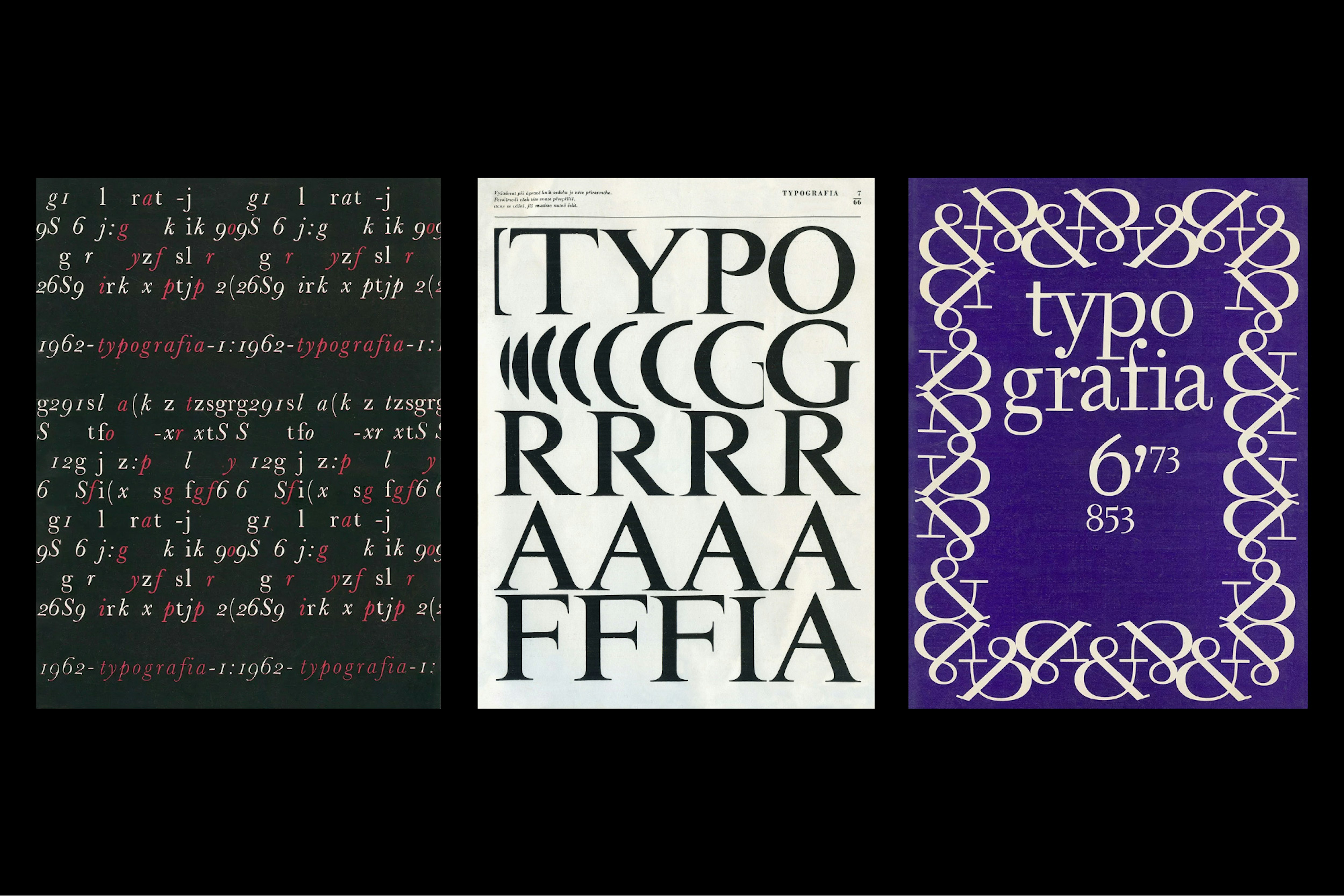
Typografia launched in 1894, becoming the print journal of Czechoslovakia. Mixing theory, technology and typography, it documented Grafotechna’s work throughout the 1960s and ’70s.

Italic and upright styles follow the same soft drawing approach, with each detail aligned to maintain overall consistency and support dynamic reading.
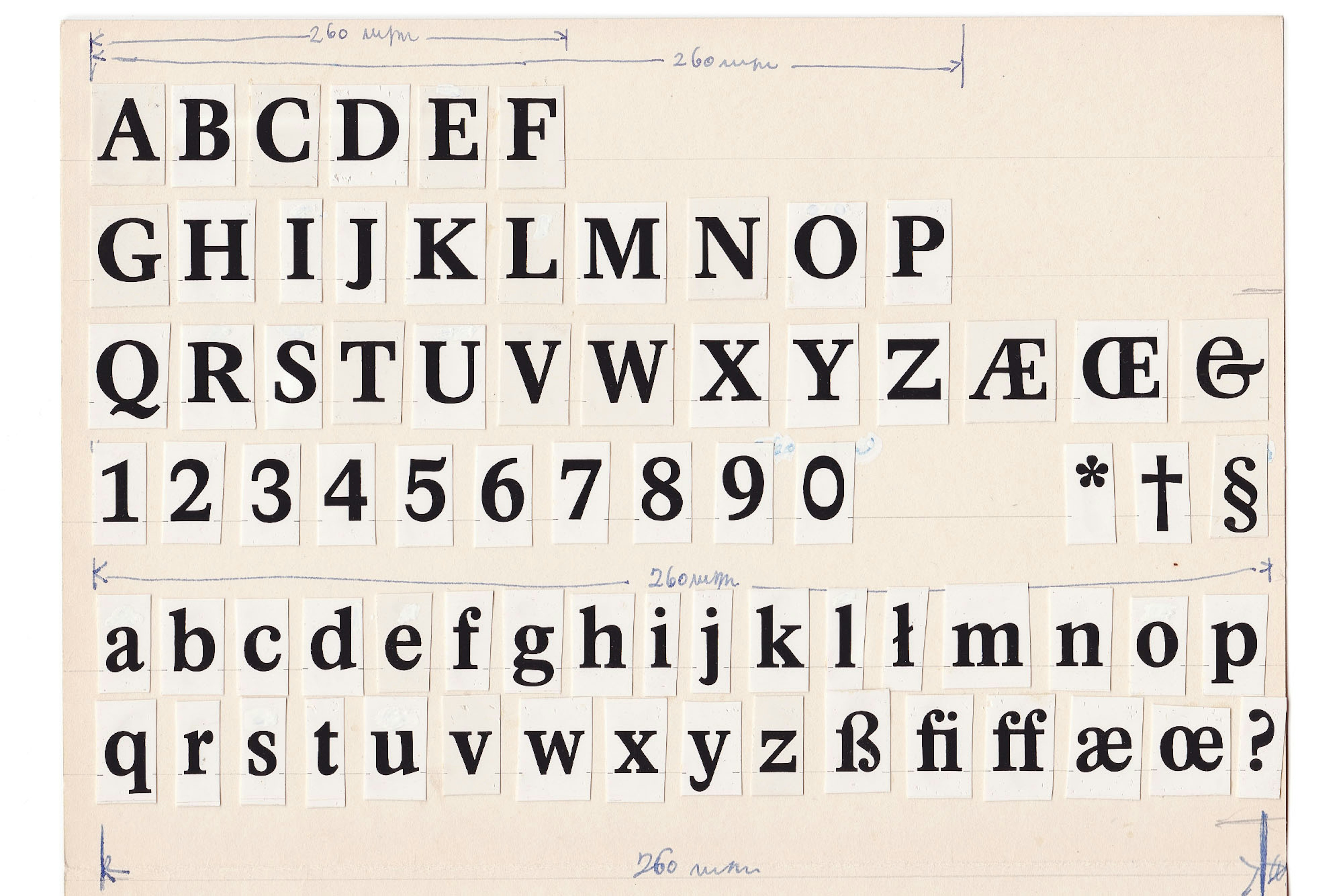
Photo-proof of Academia, Josef Týfa, 1968. Courtesy of the personal archive of Josef Týfa. Developed as part of a state-organised competition and produced by Grafotechna.

The ‘S’ blends an old-style classical form with a simplified, modern tail, while the reversed ‘z’ defines the typeface’s DNA.

Unitex, Josef Týfa, c. 1970. Logotype designed for a textile manufacturer. Sharp, flowing, and very Josef Týfa. Courtesy of UPM, Prague.

The serifs curve gently forward, like feet in motion. A subtle detail that softens the baseline and adds rhythm to the text.
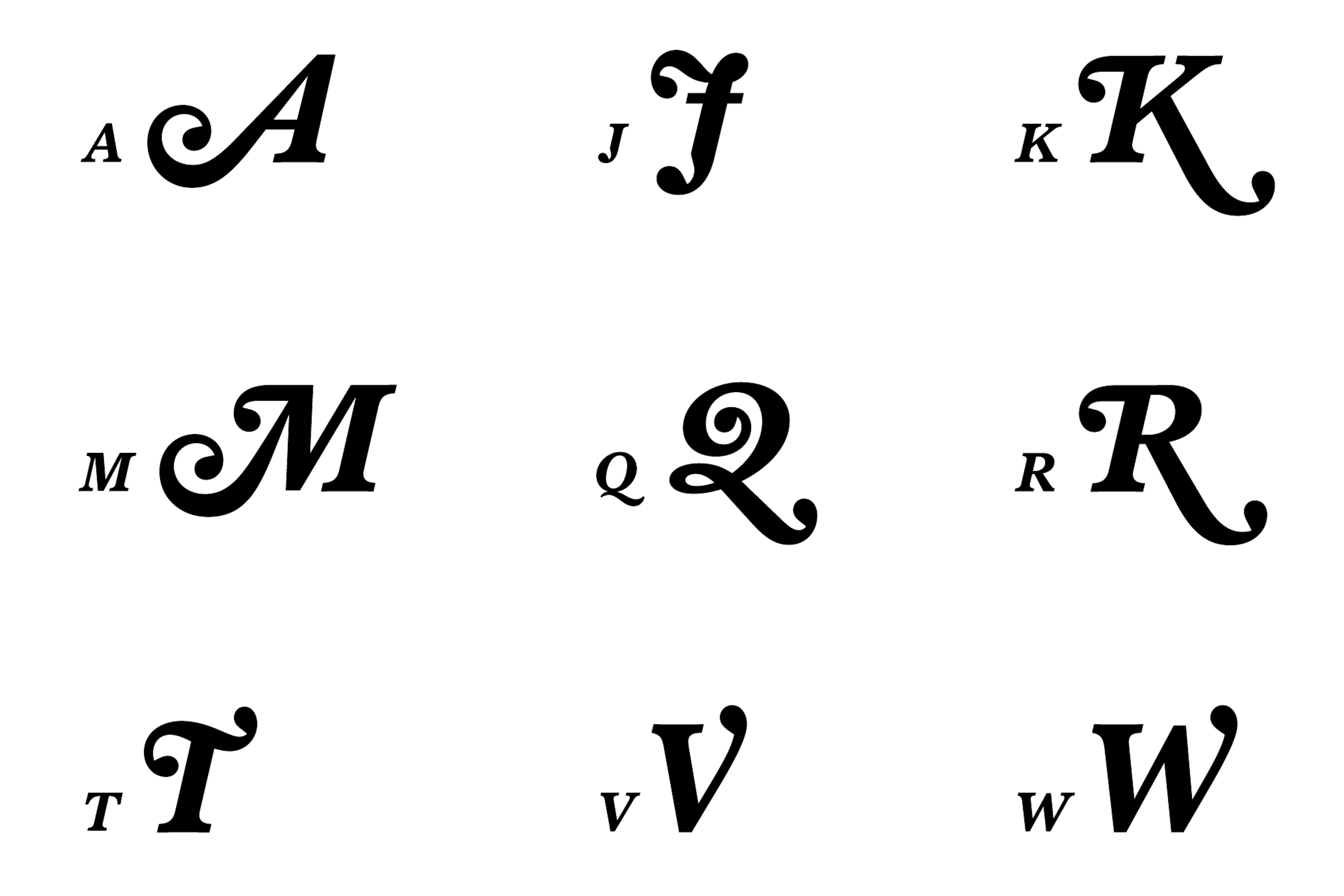
Swash variations of A, J, K, M, Q, R, T, V, and W were drawn for general and initial use inspired by Baskerville Flair.

Language to be held. Individual letters cast by Grafotechna. AllCaps rework of a drawn diagram from James Craig’s Designing with Type: A Basic Course in Typography (New York: Watson-Guptill, 1971).

The End — a moment designers celebrate when an endless project finally goes out into the world. Ondřej Báchor is happy to publish Society with AllCaps, 6 years later, after countless laser (and offset) proofs, trips to archives, correspondence with scholars, and google docs.
Buy Society Family
Single Styles
Buying guide
We offer the possibility of buying individual styles as well as complete families. The price shown is the cost of our most basic licence. Further licencing options are available during the checkout process.
Character Overview
- Character name
- Unicode Decimal
- 65
- Unicode Hex
- 41
- HTML Entity (Hex)
- A
Uppercase
- 65A
- 66B
- 67C
- 68D
- 69E
- 70F
- 71G
- 72H
- 73I
- 74J
- 75K
- 76L
- 77M
- 78N
- 79O
- 80P
- 81Q
- 82R
- 83S
- 84T
- 85U
- 86V
- 87W
- 88X
- 89Y
- 90Z
Small Caps
- 97a
- 98b
- 99c
- 100d
- 101e
- 102f
- 103g
- 104h
- 305ı
- 567ȷ
- 107k
- 108l
- 109m
- 110n
- 111o
- 112p
- 113q
- 114r
- 115s
- 116t
- 117u
- 118v
- 119w
- 120x
- 121y
- 122z
Lowercase
- 97a
- 98b
- 99c
- 100d
- 101e
- 102f
- 103g
- 104h
- 105i
- 106j
- 107k
- 108l
- 109m
- 110n
- 111o
- 112p
- 113q
- 114r
- 115s
- 116t
- 117u
- 118v
- 119w
- 120x
- 121y
- 122z
Uppercase Accents
- 193Á
- 258Ă
- 194Â
- 196Ä
- 192À
- 256Ā
- 260Ą
- 197Å
- 195Ã
- 198Æ
- 262Ć
- 268Č
- 199Ç
- 264Ĉ
- 266Ċ
- 208Ð
- 270Ď
- 272Đ
- 201É
- 276Ĕ
- 282Ě
- 202Ê
- 203Ë
- 278Ė
- 200È
- 274Ē
- 280Ę
- 7868Ẽ
- 286Ğ
- 284Ĝ
- 290Ģ
- 288Ġ
- 294Ħ
- 292Ĥ
- 7716Ḥ
- 306IJ
- 205Í
- 206Î
- 207Ï
- 304İ
- 204Ì
- 298Ī
- 302Į
- 296Ĩ
- 308Ĵ
- 310Ķ
- 313Ĺ
- 317Ľ
- 315Ļ
- 7734Ḷ
- 321Ł
- 323Ń
- 327Ň
- 325Ņ
- 330Ŋ
- 209Ñ
- 211Ó
- 334Ŏ
- 212Ô
- 214Ö
- 210Ò
- 336Ő
- 332Ō
- 216Ø
- 213Õ
- 338Œ
- 222Þ
- 340Ŕ
- 344Ř
- 346Ś
- 352Š
- 350Ş
- 348Ŝ
- 536Ș
- 7838ẞ
- 358Ŧ
- 356Ť
- 354Ţ
- 538Ț
- 218Ú
- 364Ŭ
- 219Û
- 220Ü
- 217Ù
- 368Ű
- 362Ū
- 370Ų
- 366Ů
- 360Ũ
- 7810Ẃ
- 372Ŵ
- 7812Ẅ
- 7808Ẁ
- 221Ý
- 374Ŷ
- 376Ÿ
- 7922Ỳ
- 377Ź
- 381Ž
- 379Ż
Small Caps with Accents
- 225á
- 259ă
- 226â
- 228ä
- 224à
- 257ā
- 261ą
- 229å
- 227ã
- 230æ
- 263ć
- 269č
- 231ç
- 265ĉ
- 267ċ
- 240ð
- 271ď
- 273đ
- 233é
- 277ĕ
- 283ě
- 234ê
- 235ë
- 279ė
- 232è
- 275ē
- 281ę
- 287ğ
- 285ĝ
- 289ġ
- 295ħ
- 293ĥ
- 237í
- 238î
- 239ï
- 236ì
- 299ī
- 303į
- 297ĩ
- 307ij
- 309ĵ
- 314ĺ
- 318ľ
- 322ł
- 324ń
- 328ň
- 241ñ
- 331ŋ
- 243ó
- 335ŏ
- 244ô
- 246ö
- 242ò
- 337ő
- 333ō
- 248ø
- 245õ
- 339œ
- 254þ
- 341ŕ
- 345ř
- 347ś
- 353š
- 351ş
- 349ŝ
- 223ß
- 359ŧ
- 357ť
- 250ú
- 365ŭ
- 251û
- 252ü
- 249ù
- 369ű
- 363ū
- 371ų
- 367ů
- 361ũ
- 7811ẃ
- 373ŵ
- 7813ẅ
- 7809ẁ
- 253ý
- 375ŷ
- 255ÿ
- 7923ỳ
- 378ź
- 382ž
- 380ż
Lowercase Accents
- 225á
- 259ă
- 226â
- 228ä
- 224à
- 257ā
- 261ą
- 229å
- 227ã
- 230æ
- 263ć
- 269č
- 231ç
- 265ĉ
- 267ċ
- 240ð
- 271ď
- 273đ
- 233é
- 277ĕ
- 283ě
- 234ê
- 235ë
- 279ė
- 232è
- 275ē
- 281ę
- 7869ẽ
- 287ğ
- 285ĝ
- 291ģ
- 289ġ
- 295ħ
- 293ĥ
- 7717ḥ
- 305ı
- 237í
- 238î
- 239ï
- 236ì
- 307ij
- 299ī
- 303į
- 297ĩ
- 309ĵ
- 311ķ
- 312ĸ
- 314ĺ
- 318ľ
- 316ļ
- 7735ḷ
- 322ł
- 324ń
- 329ʼn
- 328ň
- 326ņ
- 331ŋ
- 241ñ
- 243ó
- 335ŏ
- 244ô
- 246ö
- 242ò
- 337ő
- 333ō
- 248ø
- 245õ
- 339œ
- 254þ
- 341ŕ
- 345ř
- 347ś
- 353š
- 351ş
- 349ŝ
- 537ș
- 223ß
- 359ŧ
- 357ť
- 355ţ
- 539ț
- 250ú
- 365ŭ
- 251û
- 252ü
- 249ù
- 369ű
- 363ū
- 371ų
- 367ů
- 361ũ
- 7811ẃ
- 373ŵ
- 7813ẅ
- 7809ẁ
- 253ý
- 375ŷ
- 255ÿ
- 7923ỳ
- 378ź
- 382ž
- 380ż
Ligatures
- 102, 98fb
- 102, 102ff
- 102, 104fh
- 102, 106fj
- 102, 107fk
- 102, 116ft
- 102, 102, 98ffb
- 102, 102, 104ffh
- 102, 102, 105ffi
- 102, 102, 106ffj
- 102, 102, 107ffk
- 102, 102, 108ffl
- 64257fi
- 64258fl
Proportional Figures
- 480
- 491
- 502
- 513
- 524
- 535
- 546
- 557
- 568
- 579
Tabular Figures
- 480
- 491
- 502
- 513
- 524
- 535
- 546
- 557
- 568
- 579
Oldstyle Figures
- 480
- 491
- 502
- 513
- 524
- 535
- 546
- 557
- 568
- 579
Currency & Math
- 8383₿
- 162¢
- 164¤
- 36$
- 8364€
- 8356₤
- 8378₺
- 163£
- 165¥
- 8901⋅
- 43+
- 8722−
- 215×
- 247÷
- 61=
- 8800≠
- 62>
- 60<
- 8805≥
- 8804≤
- 177±
- 8776≈
- 126~
- 172¬
- 94^
- 8734∞
- 8709∅
- 8747∫
- 960π
- 8710∆
- 8486Ω
- 181µ
- 8719∏
- 8721∑
- 8730√
- 8706∂
- 37%
- 8240‰
Superscript
- 8304⁰
- 185¹
- 178²
- 179³
- 8308⁴
- 8309⁵
- 8310⁶
- 8311⁷
- 8312⁸
- 8313⁹
Subscript
- 8320₀
- 8321₁
- 8322₂
- 8323₃
- 8324₄
- 8325₅
- 8326₆
- 8327₇
- 8328₈
- 8329₉
Ordinals
- 170ª
- 186º
Punctuation & Symbols
- 46.
- 44,
- 58:
- 59;
- 8230…
- 33!
- 161¡
- 63?
- 191¿
- 183·
- 8226•
- 35#
- 47/
- 92\
- 40(
- 41)
- 123{
- 125}
- 91[
- 93]
- 45-
- 8211–
- 8212—
- 95_
- 8218‚
- 8222„
- 8220“
- 8221”
- 8216‘
- 8217’
- 8249‹
- 8250›
- 34"
- 39'
- 9679●
- 9675○
- 9632■
- 9633□
- 9674◊
- 64@
- 38&
- 182¶
- 167§
- 169©
- 174®
- 8471℗
- 8482™
- 176°
- 8242′
- 8243″
- 124|
- 166¦
- 8224†
- 8225‡
Small Caps Punctuation & Symbols
- 33!
- 161¡
- 63?
- 191¿
- 47/
- 92\
- 40(
- 41)
- 123{
- 125}
- 91[
- 93]
Fraction
- 189½
- 8585↉
- 8531⅓
- 8532⅔
- 188¼
- 190¾
- 8533⅕
- 8534⅖
- 8535⅗
- 8536⅘
- 8537⅙
- 8538⅚
- 8528⅐
- 8539⅛
- 8540⅜
- 8541⅝
- 8542⅞
- 8529⅑
- 8530⅒
Arrows
- 8592←
- 8593↑
- 8594→
- 8595↓
- 8596↔
- 8597↕
- 8598↖
- 8599↗
- 8600↘
- 8601↙
- 8624↰
- 8625↱
- 8626↲
- 8627↳
- 11024⬐
- 11025⬑
- 11022⬎
- 11023⬏
- 8617↩
- 8618↪
- 8630↶
- 8631↷
- 8634↺
- 8635↻
- 8646⇆
- 8693⇵
Global
- 59729